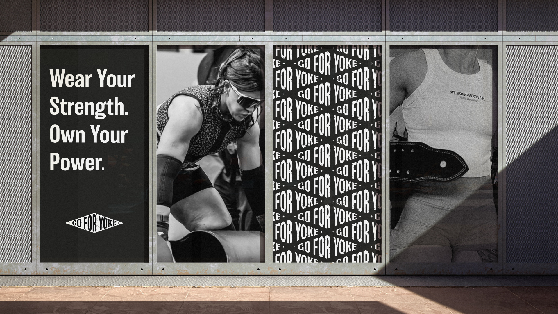
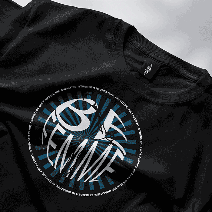
About the brand

Go For Yoke is a bold and empowering strongwoman brand designed for athletes, sports enthusiasts, and anyone who wants to embrace strength, confidence, and resilience in their daily lives. The brand’s mission is to champion the growth of women in strength sports, fostering a vibrant community that breaks free from outdated norms. Go For Yoke challenges the idea that strength must fit into a single definition—it’s about confidence, creativity, and individuality.

The Challenge

To create a visual identity that strikes the perfect balance between femininity and masculinity—something that resonates with athletes while also feeling natural beyond the gym. Traditional strongman apparel often leans heavily masculine, leaving many women without a brand they truly connect with. This project was about more than just design—it was about redefining strength and self-expression, making space for a new kind of representation in the strongwoman community.

The Solution

We developed a bold yet inclusive brand identity that reflects the essence of Go For Yoke. Through creativity and thoughtful design, we crafted visuals and messaging that welcome all genders who support strong women in sports and everyday life. Additionally, we designed custom illustrations, one of which became their signature piece—capturing the confidence, individuality, and energy that the brand stands for.

A large storefront display featuring Go For Yoke branding. The left panel displays the slogan "Wear Your Strength. Own Your Power." in bold white letters on a black background. The centre panel showcases a black-and-white image of a strong woman lifting weights, wearing sunglasses and a patterned top. The right panel has a repeating Go For Yoke logo pattern and a close-up of a woman wearing a tank top labelled "Strongwoman" with a weightlifting belt slung over her shoulder.
This bold and dynamic T-shirt design redefines strength beyond traditional masculine traits. The circular composition, featuring striking purple and white elements, symbolizes creativity, intuition, and resilience. The central typography, combined with a stylized illustration, conveys empowerment with a contemporary edge. It is a statement piece for those who embrace strength in all its forms.
A green T-shirt featuring a bold graphic design with the word "Be Femme" distorted in a circular shape. A stylised illustration of a weightlifter overlays the text in light blue, emphasising strength and movement. Around the design, there is a circular inscription that reads: "Strength can be creative, intuitive, and patient. Physical strength is not simply defined by competitiveness.
A black T-shirt with an animated design showcasing the words "BE FEMME" in a circular, dynamic typography. The design features a blue radial burst pattern behind the text, giving an energetic feel. A stylised illustration of a weightlifter is integrated into the design. The text around the circle reads: "Strength is not defined by only masculine qualities. Strength is creative, intuitive, and patient." The animation adds a shifting effect, making the design appear vibrant and interactive.

LET'S BRING YOUR VISION TO LIFE

The Studija Vibe logo in white featuring a disco ball icon alongside the text "studija vibe," blending playful energy with a professional touch.

Privacy Policy

T&C’s

FAQ